
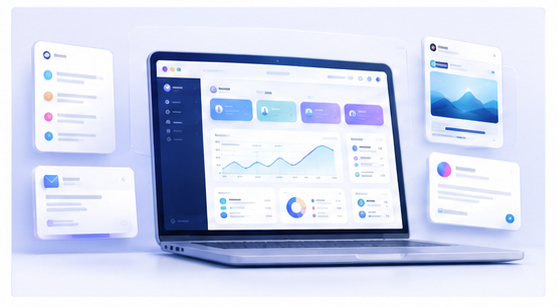
Create Product Comparison Graphics with Mockups for SEO Articles
Comparison articles are powerful SEO assets. Pages like “best tools for creators,” “alternative to a design template workflow,” or “online mockup editor vs static templates” can attract users who are actively evaluating solutions. But many comparison pages are text-heavy and visually weak. Mockups can make them easier to understand.
Why visuals improve comparison content
When users compare tools, they want clarity. They want to know what each option looks like, how the workflow feels, and whether the product matches their needs. A comparison table is useful, but a visual example can make the difference easier to understand.
A mockup helps present screenshots in a clean, consistent way. Instead of inserting raw interface captures with different sizes and styles, you can frame each product screen in a similar visual system.
Use mockups to explain workflow differences
For a mockup editor, one useful comparison is workflow speed. A static template may require downloading files, opening design software, replacing smart objects, adjusting layers, and exporting. A browser-based editor can reduce that process to uploading, adjusting, and exporting.
You can show this difference visually by placing workflow screenshots into a structured mockup composition. This helps readers understand the practical advantage instead of only reading about it.
Create comparison images in Animock
Open the Animock editor, upload your screenshots, and create clean mockup graphics for your SEO article. You can build a hero image for the comparison page, feature section images, or smaller supporting visuals that explain specific use cases.
This is useful for articles targeting long-tail search queries because the visual can match the exact search intent. A page about app mockups should show app mockups. A page about browser mockups should show browser scenes. A page about launch visuals should show launch-ready product graphics.
Keep comparison visuals fair and clear
Comparison content should be credible. Do not make one option intentionally unreadable or misleading. Use visuals to explain differences honestly. If your product is faster, show the shorter workflow. If it is easier for non-designers, show the simpler interface. If it is browser-based, show the web workflow clearly.
Trust is more valuable than aggressive visual claims. Clear comparison images can support a strong argument without feeling exaggerated.
Where to place mockups in comparison articles
Use one strong mockup near the top of the article to set the context. Add supporting mockups in sections that explain workflow, output quality, use cases, or channel-specific exports. Avoid placing too many large images in a row, because that can slow reading and reduce focus.
Optimize for SEO and conversion
Use descriptive file names, relevant alt text, and article headings that match the comparison intent. Pair each visual with a short explanation and a clear call to action. The reader should understand why the mockup matters and what to do next.
Need comparison graphics for your next SEO article? Use the Animock online editor to create polished product mockups that make your content more useful and conversion-focused.
Good comparison pages are not only about ranking. They should help users make a confident decision.