
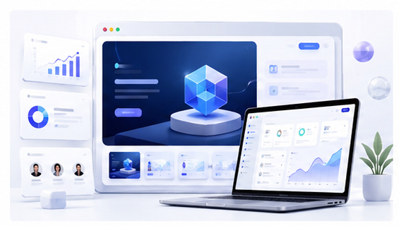
Founder Investor Demo Mockups for Startup Pitches
When a founder presents a startup idea, the product visual often matters as much as the product description. Investors, partners, and early users need to understand what the product does quickly. A plain screenshot can communicate the interface, but a polished mockup can make the product feel more complete, more credible, and easier to remember.
Why pitch decks need better product visuals
Many early-stage pitch decks rely too heavily on text. They explain the market, the problem, the business model, and the roadmap, but the actual product may appear in one small screenshot. This can create a gap between the promise and the proof. A mockup closes that gap by turning the interface into a visual story.
A strong product mockup does not need to exaggerate the product. It should simply present the current interface in a clean, focused, and professional way. For founders, this is especially useful when the team is still small and does not have a dedicated design department.
Choose the most persuasive product screen
Do not automatically use the dashboard home page. The best pitch visual is usually the screen that shows the product solving the core problem. For an AI writing tool, this may be a before-and-after output. For an analytics product, it may be a clear insight panel. For a creator tool, it may be the export-ready result.
The mockup should help the viewer understand one thing: why this product is useful. If the screenshot does not support that message, choose another screen.
Create mockups without slowing down the pitch workflow
Founders often revise pitch materials many times. Instead of rebuilding visuals manually in complex design software, open the Animock editor, upload the latest screenshot, place it into a 3D device or browser scene, and export a clean image for your deck or update.
This workflow is helpful when your interface changes during product development. You can refresh the mockup before a meeting without redesigning the entire slide.
Use mockups in the right pitch sections
Mockups work well in the product overview slide, demo flow slide, traction update, roadmap preview, and closing slide. A single hero mockup can make the opening feel more polished, while smaller mockups can support feature explanations later in the deck.
For investor updates, mockups can also make monthly progress reports more visual. Instead of saying that a new feature shipped, show the shipped feature inside a clean product frame.
Keep the image honest and readable
A pitch mockup should not hide weak product details behind excessive decoration. Keep the product screen readable. Avoid extreme perspective angles that make UI text impossible to understand. Use soft depth, clean spacing, and enough contrast so the interface remains the focus.
Repurpose the same visual after the meeting
The same mockup can support your website, Product Hunt gallery, LinkedIn launch post, investor email, and founder newsletter. This makes each visual asset more valuable and keeps your product communication consistent.
Preparing a pitch or investor update? Use the Animock online editor to turn your product screenshot into a polished startup demo mockup.
A clear mockup will not replace a strong business, but it can help people understand your product faster. In a pitch environment, that clarity is valuable.